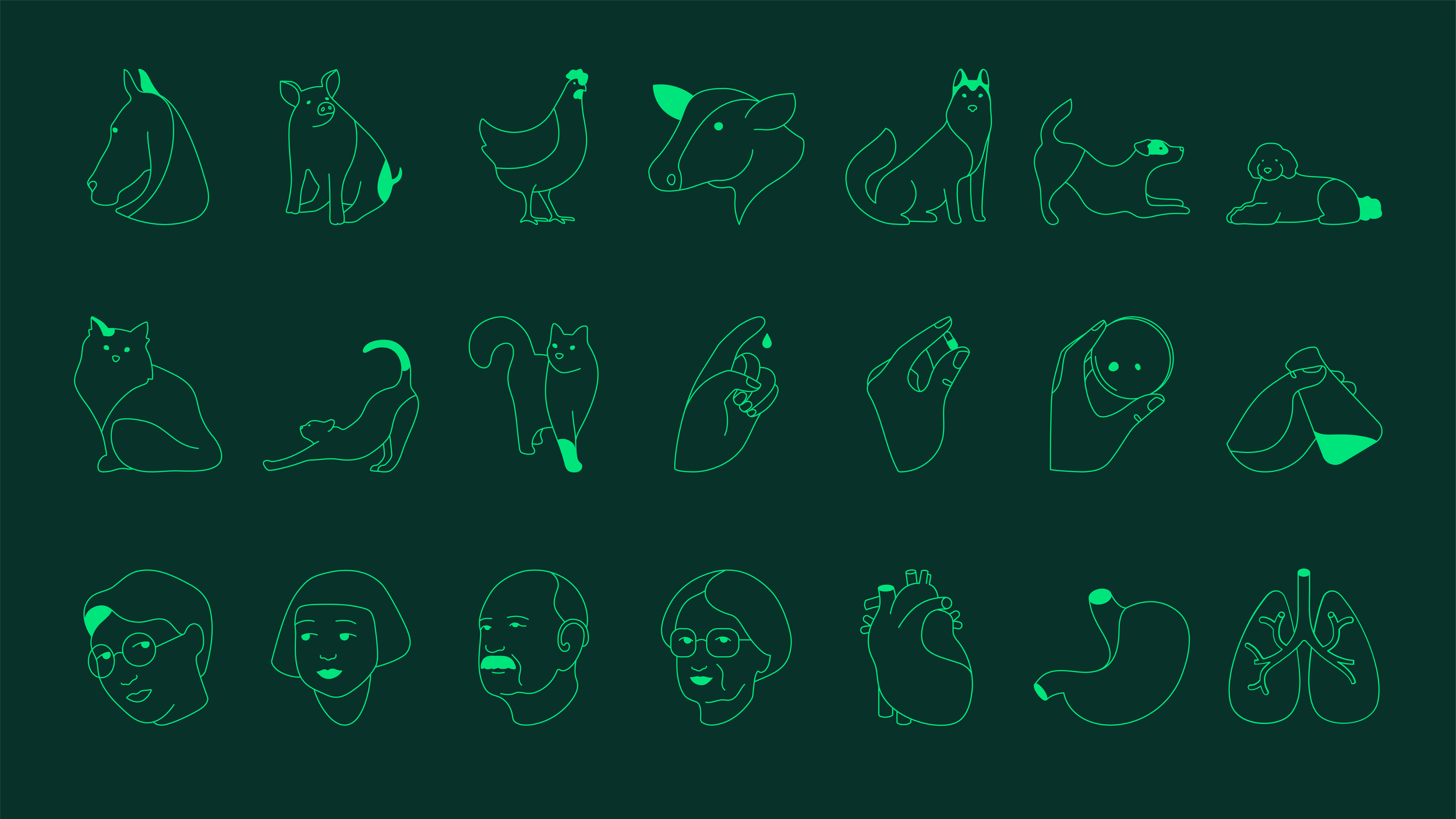
360° Boehringer Ingelheim illustrations
ILLUSTRATION • CONCEPT DESIGN • BRANDING
-
Redesign Boehringer Ingelheim’s corporate identity to boost visibility, customer engagement, and growth in new business areas, all while supporting their commitment to sustainability.
We needed to create a modern, digital-first brand experience for a research-driven pharmaceutical company, balancing innovation with the brand's deep-rooted history. -
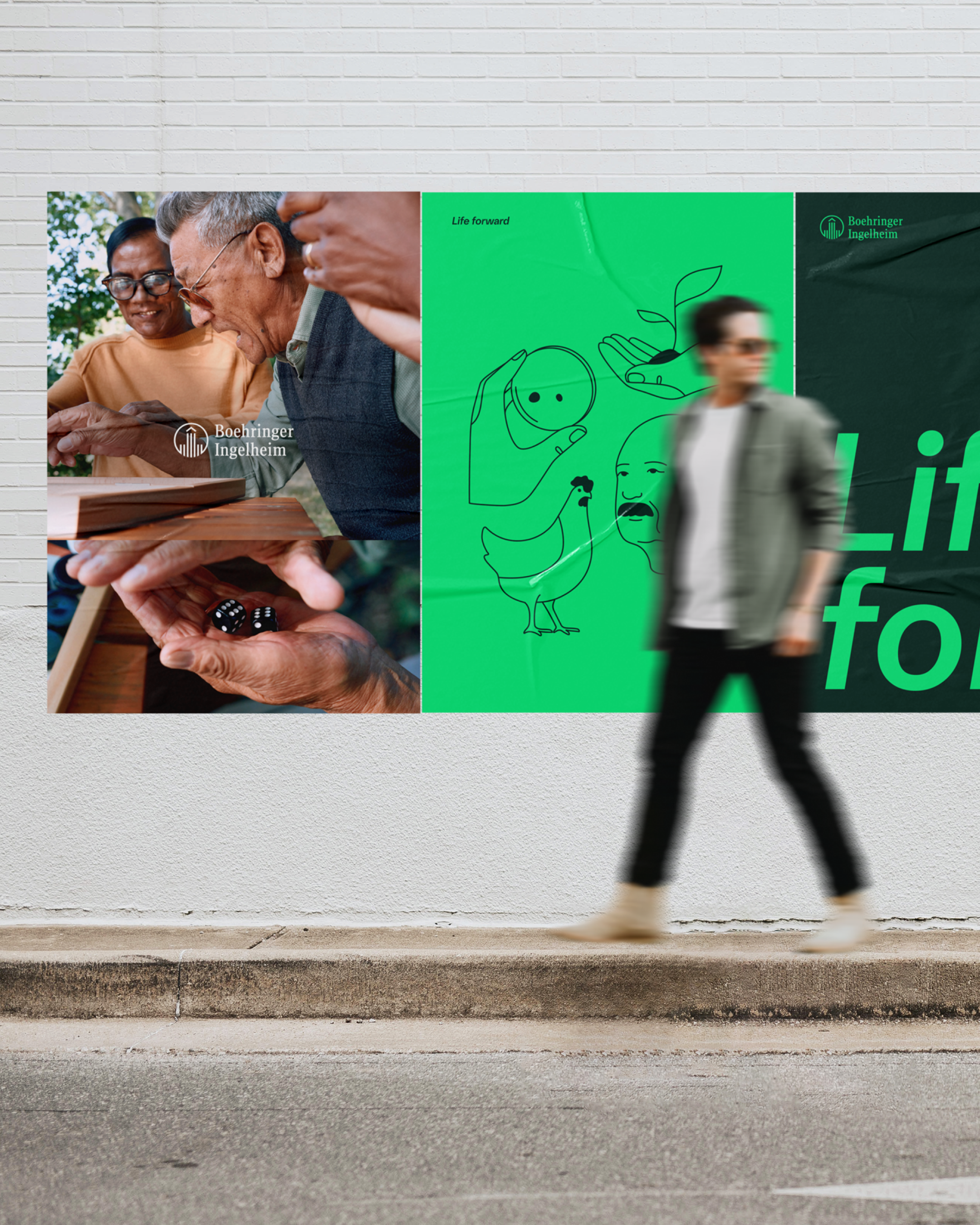
Together with Interbrand, we worked on the full re-brand identity of Boehringer Ingelheim, giant of the pharmaceutical world. Together with supporting the team during the development of the identity, I focused on the development of the new illustrative style, taking care of all the communication with the client and stakeholders till the final delivery, included a well developed guideline and artworks.
-
I was asked to create a brand new illustrative style for the new identity.
I developed a unique style that brought the brand to life across all touchpoints. Managed daily the client and managing the full project on my own including artworks, stakeholders, reviews, scope and anything related to the illustrative topic.
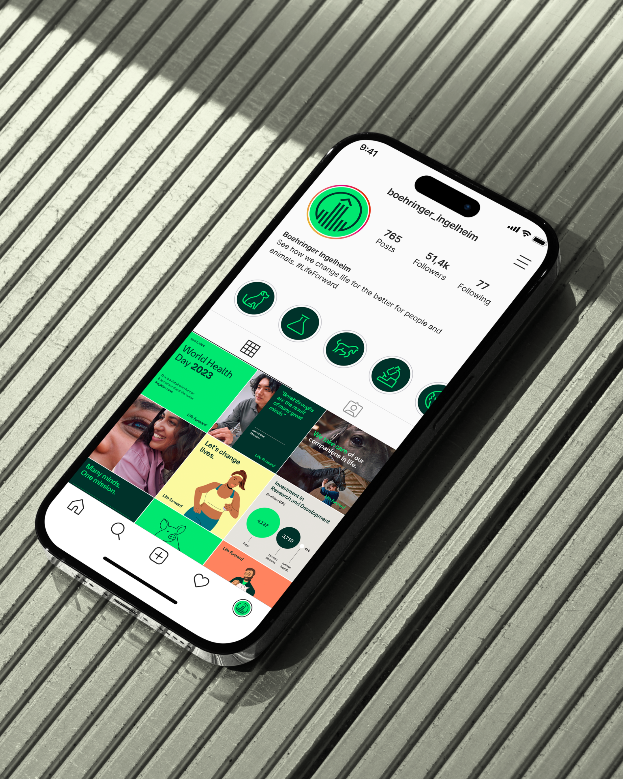
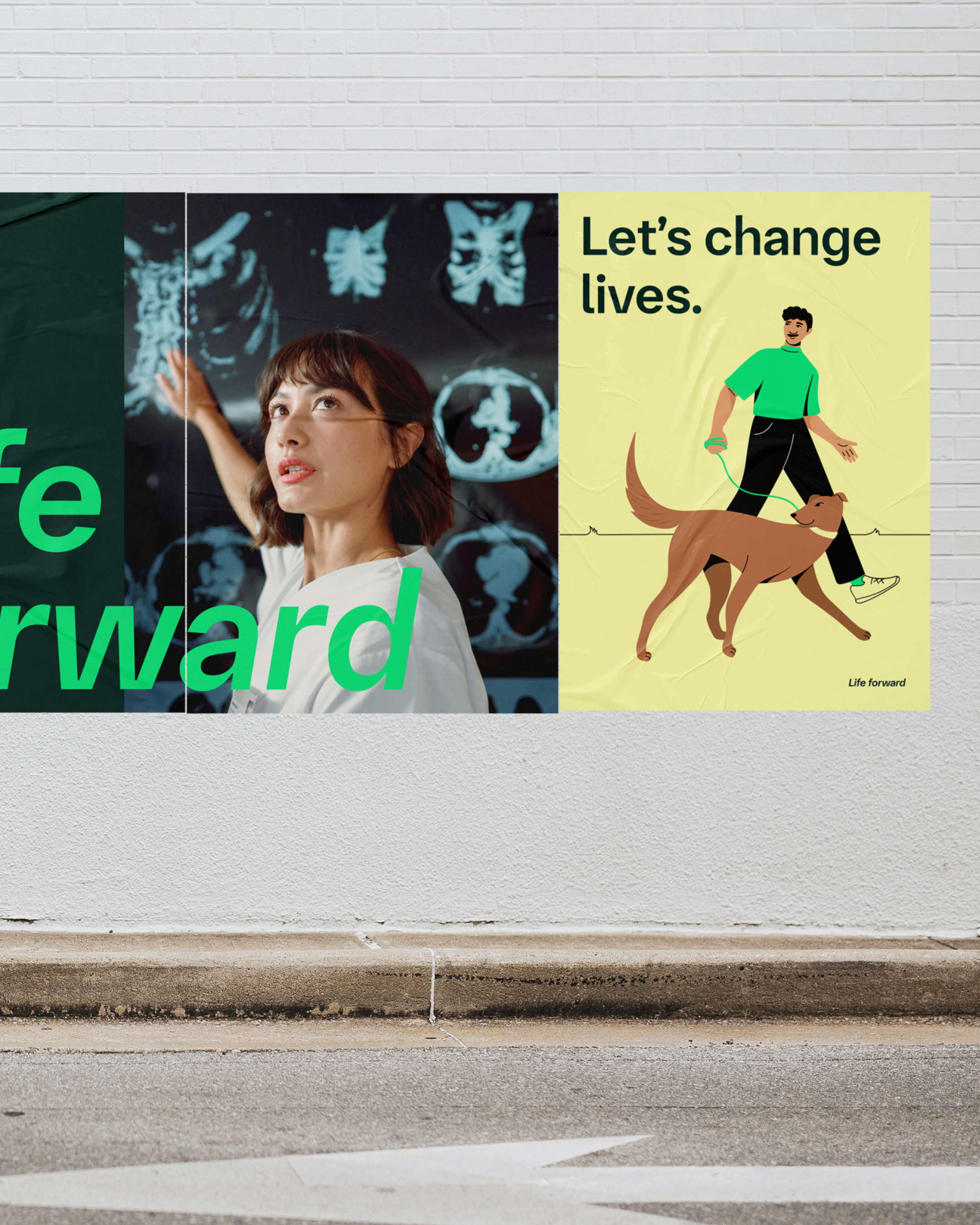
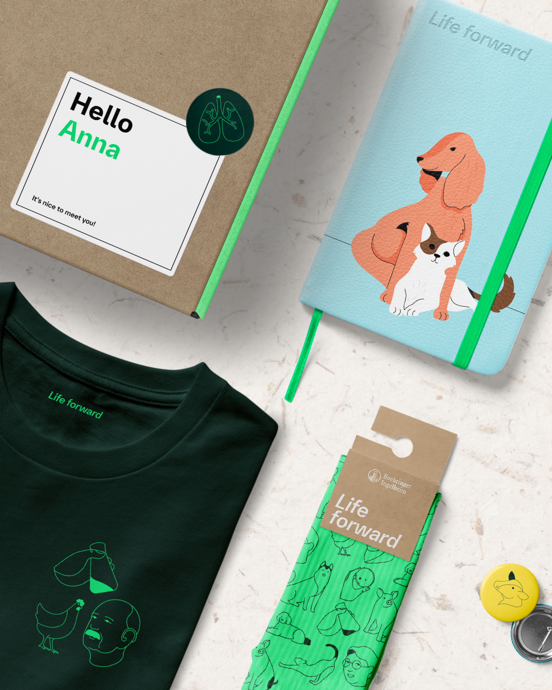
The new illustration style is guided by the new brand core: 'Unwavering optimism'. Through simple lines and shapes, they conveys themes like collaboration, resilience, and innovation.
We illustrate with a sense of positivity across a wide range of subjects, from medical to innovation to lifestyle. One way we do this is by using warm color palettes and a handmade look and feel.
-

Standalones
The first illustration style is called Standalone. These simpler illustrations frame articles or sections, giving readers a quick idea of the content's subject. We use these frequently in social media posts and stories.
-

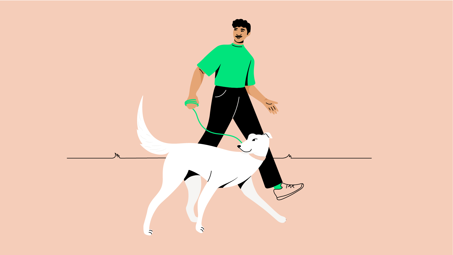
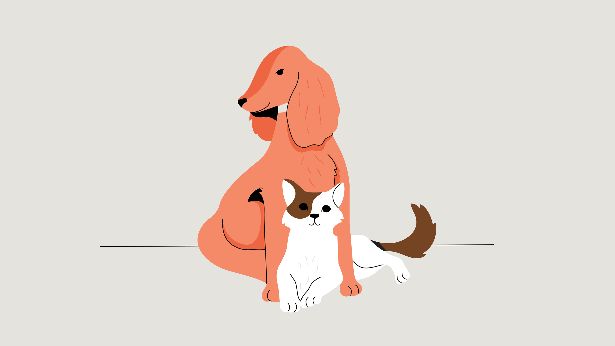
Scene
The second level, Scene, showcases illustrations that are emotive and rich in detail. They're ideal for depicting complex scenes and complementing associated headlines. These illustrations are nuanced and engage the reader on a deeper level, frequently appearing in editorial and digital touchpoints.
-

Technical
The third level, Technical, features the most detailed and precise illustrations in the set. These illustrations precisely convey complex medical processes and technical information. We use them in editorial materials and on the website.





Survey, Guideline and Library
To ensure our illustrative style was both inclusive and respectful, we conducted several surveys to gather feedback from a wide range of audiences. This feedback informed our approach, helping us create a style that aligns with the brand's needs and resonates with diverse groups.
We delivered the project along with a comprehensive guide designed to support both future illustrators and stakeholders who need to understand how to use and create illustrations within the brand's framework. Our goal was to provide a complete package that would help the client avoid inconsistent illustrations in the future and ensure the style is consistently maintained.
Additionally, we prepared a fully accessible library containing various formats and color palettes to meet the client's everyday needs.
This comprehensive resource allows for seamless integration into the client's ongoing tasks, ensuring uniformity and accessibility in all visual materials.
